


Creating attractive visual content is no longer limited to professional designers with expensive software. Businesses, creators, marketers, and print-on-demand sellers can use ready-made graphics, editable templates, and online design tools to turn simple ideas into polished visuals. The real challenge is knowing how to choose the right resources and adapt them without making every project look generic.
Vexels is a design platform offering graphics, templates, illustrations, mockups, and creative tools for different visual projects. Its resources can support social media content, branding, print materials, merchandise, and other creative work. With a large selection available, users can spend less time creating every element from scratch and more time improving the overall concept.
However, good design is not simply about finding an attractive image. A successful visual should communicate a clear message, match the intended audience, and work properly on the platform or product where it will appear.
Start With a Clear Design Purpose
Before searching for graphics, decide what you want the design to achieve. A social media post may need to capture attention quickly, while a product design should remain attractive and readable when printed. A website banner has different requirements from a promotional flyer, even when both use similar visual elements.
With Vexels, users can explore different types of graphics and templates for various creative needs. Starting with the purpose of the project makes it easier to narrow the selection and avoid downloading resources simply because they look interesting.
Write down the main message in one sentence before opening a design library. Then identify your audience and decide where the finished design will be used. These simple questions can influence everything from color selection to typography and image placement.
Also consider the action you want viewers to take. If you are promoting a product, the product should remain visually important. If you are sharing educational information, readability should take priority over decoration.
A clear purpose gives every design decision a direction. It also makes editing easier because you can quickly remove elements that do not contribute to the main message.

Choose Graphics That Match Your Brand
Consistency is one of the simplest ways to make a business appear more professional. Different campaigns can have different layouts, but they should still share recognizable visual elements. Consistent colors, typography, shapes, and imagery can help people identify your content more easily.
Vexels provides graphics and templates across many styles and categories, which gives creators plenty of room to build a visual direction. Instead of choosing resources randomly, decide what kind of personality your brand should communicate.
For example, a children’s brand may benefit from colorful illustrations and playful shapes, while a technology company may prefer cleaner layouts and restrained colors. A fashion business might use elegant typography and photography-inspired graphics.
If your brand already has established colors, adapt suitable resources to those shades when possible. Limit the number of fonts you use and keep similar typography across related designs. Too many unrelated fonts can make an otherwise strong visual feel confusing.
The goal is not to make every post identical. Instead, create a recognizable visual language that allows different designs to feel connected.
When selecting a graphic, ask whether it fits your brand before asking whether it simply looks attractive. That small change in thinking can significantly improve visual consistency.
Use Templates to Save Creative Time
Starting every project from a blank canvas can take considerable time. Templates provide a useful foundation by giving you an initial structure for composition, spacing, typography, and imagery.
Vexels offers editable design resources that can help creators begin projects faster. Instead of spending the first part of a project deciding where every element should go, you can start with an existing layout and adapt it to your needs.
However, avoid using a template exactly as you found it when creating important brand content. Change the wording, colors, typography, illustrations, and spacing where appropriate. Remove elements that do not support your message.
A template should be treated as a creative starting point rather than a finished answer. Its biggest advantage is the time it saves while still allowing you to make meaningful changes.
Templates can also help beginners understand design principles. By studying how a professional layout uses hierarchy and spacing, you can learn how different elements work together.
For recurring campaigns, create several reusable layouts. This can make future production faster and help your content maintain a consistent appearance.
The time saved through templates can then be invested in stronger messaging, better research, and more thoughtful customization.
Design According to the Final Product
A design that looks excellent on a computer screen may not work equally well when printed on a shirt, mug, poster, packaging material, or other physical product. The final format should influence your design decisions from the beginning.
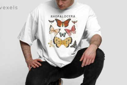
When using Vexels resources for merchandise or print projects, consider the available printing area, product color, viewing distance, and overall size. A detailed illustration may look impressive on a large poster but become difficult to understand when reduced to a smaller product.
Text deserves particular attention. Keep important words large enough to remain readable and avoid placing essential information too close to the edges.
Mockups can be useful for checking how artwork may appear on a finished product. A design that looks balanced on a flat screen can sometimes appear too small or crowded when placed on an actual item.
Before exporting, check the technical requirements of the platform, printer, or marketplace where the design will be used. File format, dimensions, resolution, and background requirements can affect the final result.
It is much easier to adjust these details before publishing than after a product has already been printed or uploaded.
Designing with the final destination in mind helps prevent unnecessary revisions and ensures that your creative work looks as intended.
Make Social Media Graphics Easier to Read
Social media users scroll quickly, so visual communication needs to be immediate. An attractive image is useful, but it should also make the main message easy to understand.
When using Vexels graphics for social media, start with one central idea. Avoid filling the canvas with too many illustrations, long paragraphs, decorative elements, and competing messages.
Use visual hierarchy to guide attention. The most important information should be noticeable first, followed by supporting details. Larger text, contrast, spacing, and positioning can help establish that order.
Leave enough empty space around important elements. Crowded designs can make even excellent content difficult to understand, particularly on smaller mobile screens.
Images should support the message rather than distract from it. If the background is complicated, simplify it or position text within an area where it remains easy to read.
You can also create related layouts for different content types. Educational posts, promotional announcements, product highlights, and inspirational content can each have different structures while sharing the same brand colors and typography.
This approach creates variety without losing consistency. Over time, recognizable design patterns can make your social media presence feel more organized and professional.
Remember that visual quality and communication should work together. A beautiful design that people cannot understand quickly has limited value.
Check Licensing Before Commercial Use
One of the most important parts of using downloadable graphics is understanding how the resources may be used. A design that looks perfect for a project may have specific licensing conditions, especially when you plan to sell products or create commercial materials.
Before using Vexels resources commercially, review the applicable license and usage terms for the particular asset or subscription. Licensing conditions can differ depending on the type of resource and intended use.
Do not assume that downloading a graphic automatically gives you unlimited rights. Check whether the resource can be modified, printed on merchandise, used for client projects, or incorporated into another commercial design.
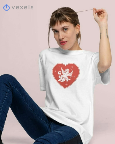
This is especially important for businesses and print-on-demand sellers. If a design will appear on shirts, mugs, posters, packaging, or other products, confirm that your intended use is permitted.
It is also helpful to keep records of the resources and licenses used in important projects. Organized documentation can make future checks easier and reduce uncertainty when working with clients.
If you are unsure about a licensing condition, review the current terms before publishing or selling the design. Do not rely on assumptions based on how another creator appears to be using the same resource.
Taking a few minutes to understand licensing can protect your project and help you build a more responsible creative workflow.
Creating effective visual content is about much more than downloading attractive graphics. The strongest results come from combining useful resources with a clear message, consistent branding, thoughtful editing, and an understanding of the final platform or product.
Vexels can help creators work more efficiently by providing graphics, templates, and design resources for different creative projects. Instead of starting every design from nothing, users can begin with suitable assets and customize them according to their goals.
Start every project by defining its purpose. Know what you want viewers or customers to understand, and choose resources that support that message. Then build consistency through colors, typography, layouts, and visual style.
Templates can reduce production time, but customization is essential if you want your content to feel distinctive. Change the elements that matter and remove anything that does not contribute to your idea.
For social media, prioritize readability and hierarchy. For merchandise, consider print size, placement, and product color. For commercial projects, always check the relevant licensing conditions before using an asset.
Most importantly, develop a repeatable design process. A reliable workflow makes it easier to produce high-quality content regularly without sacrificing creativity.
You do not need complicated artwork to create a strong visual presence. You need purposeful design, appropriate resources, and thoughtful execution. With the right approach, creators and businesses can turn simple ideas into professional visuals that communicate clearly, support their brand, and capture attention.